
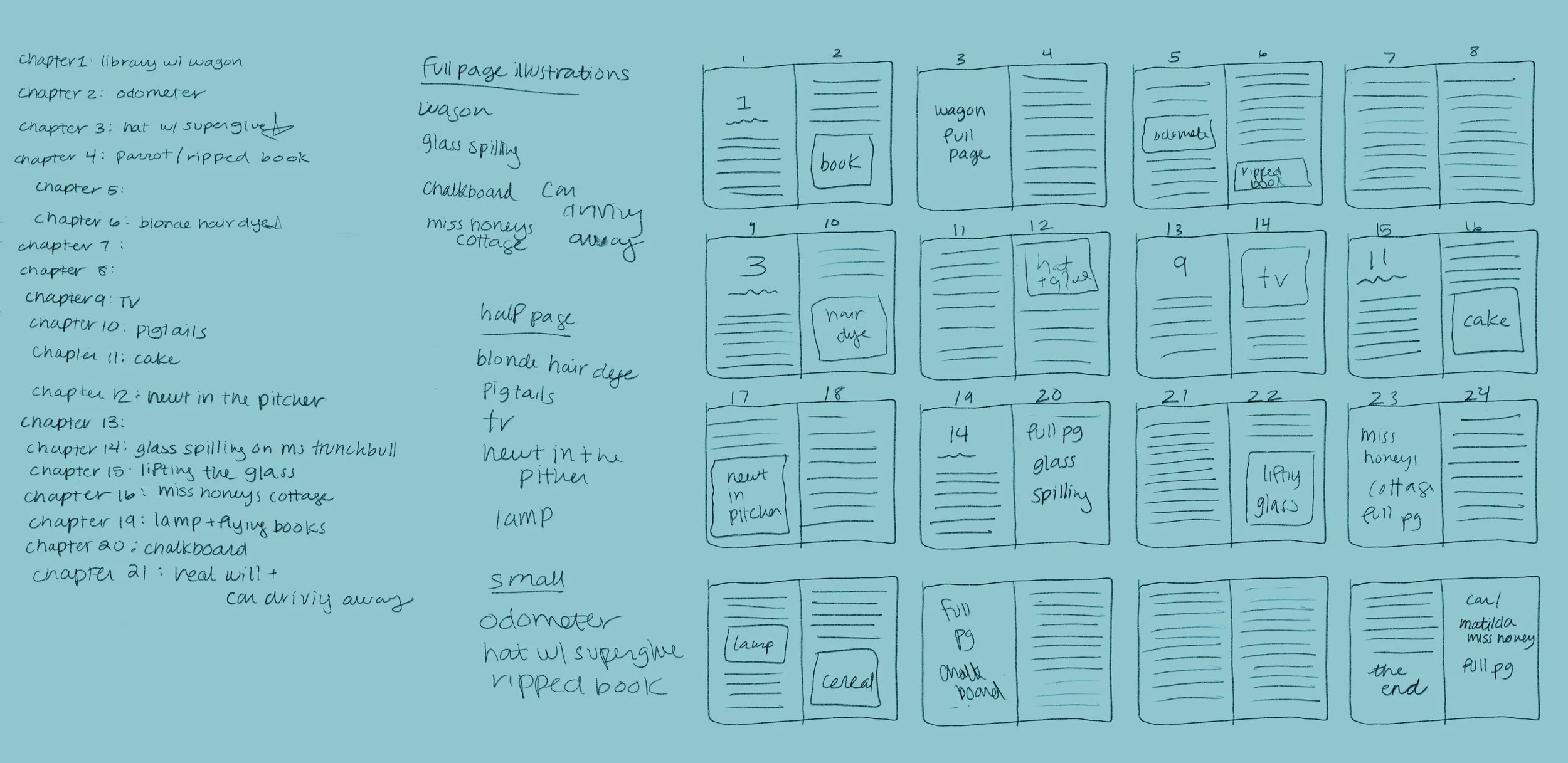
The Challenge
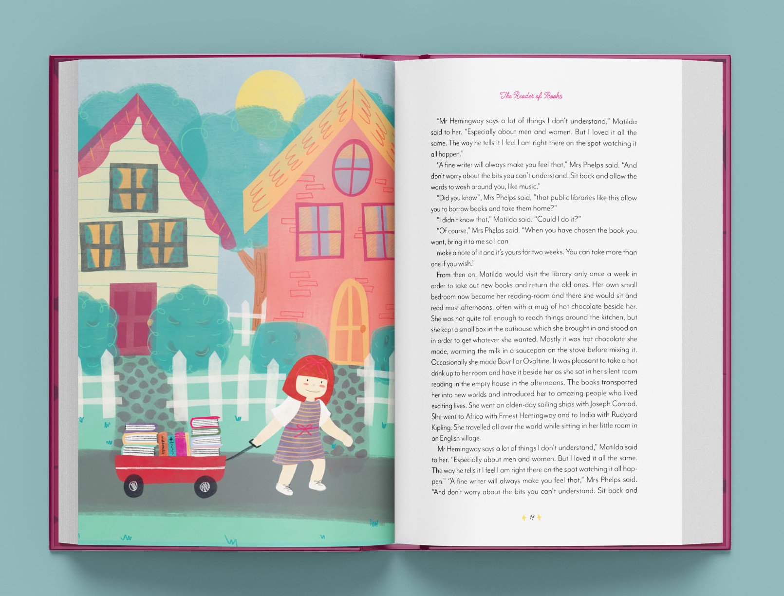
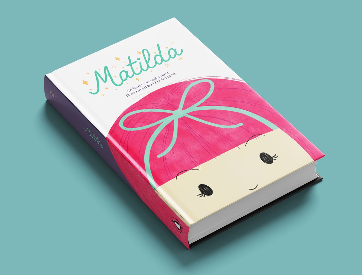
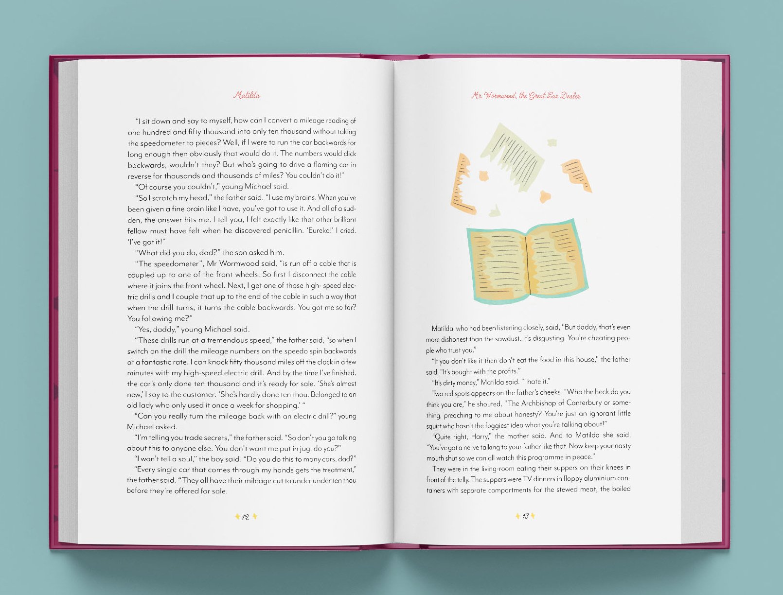
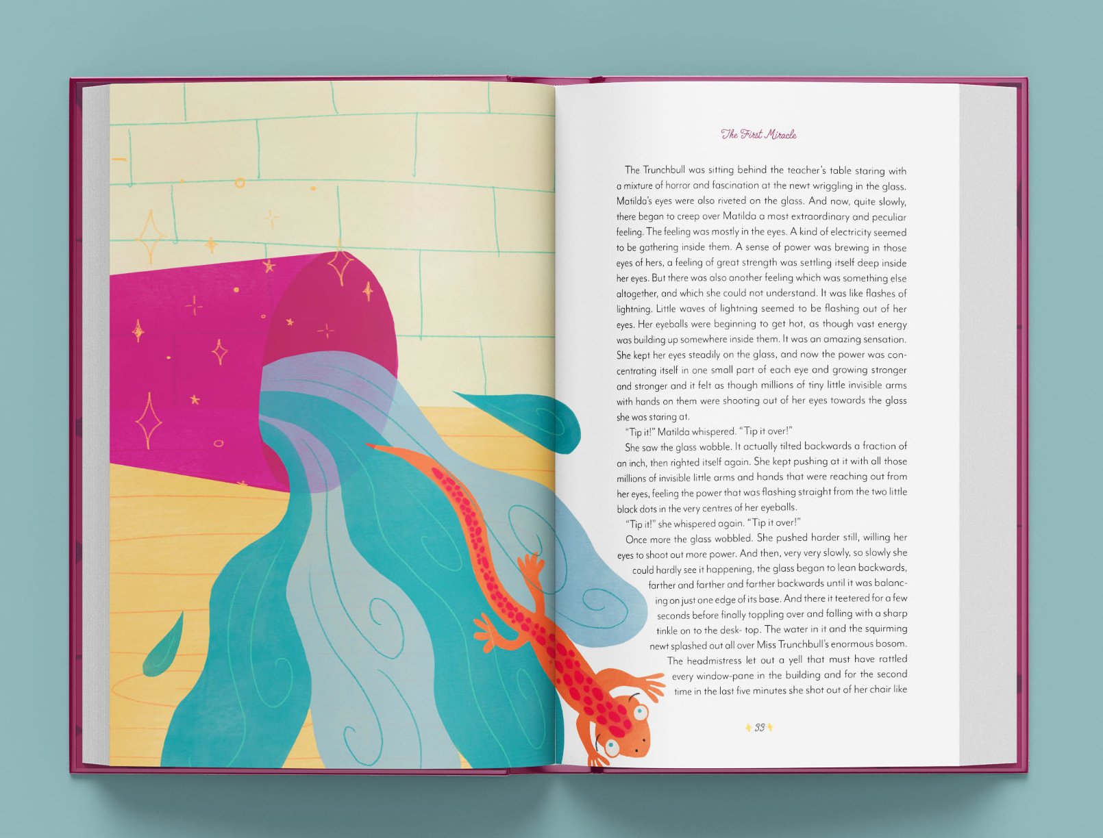
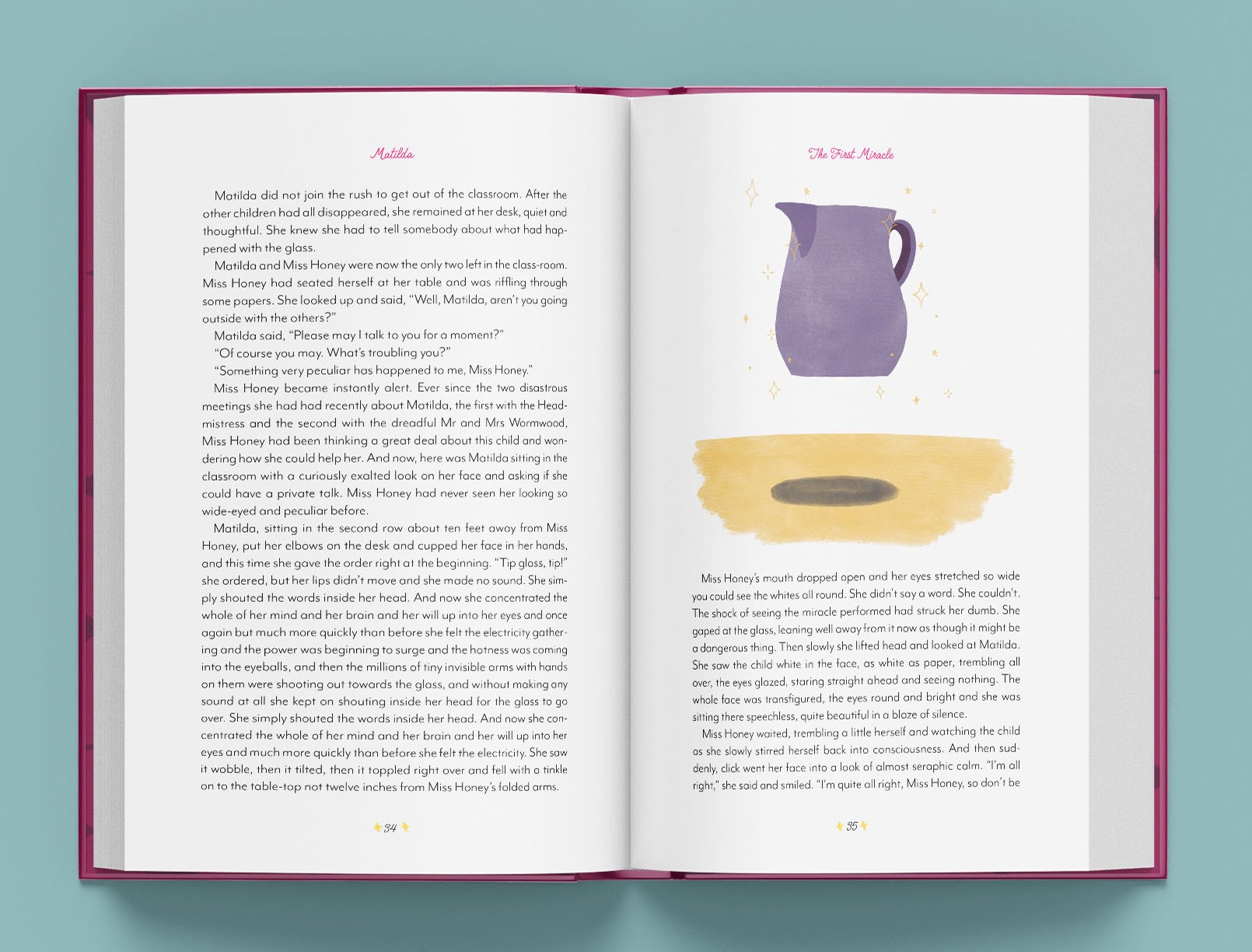
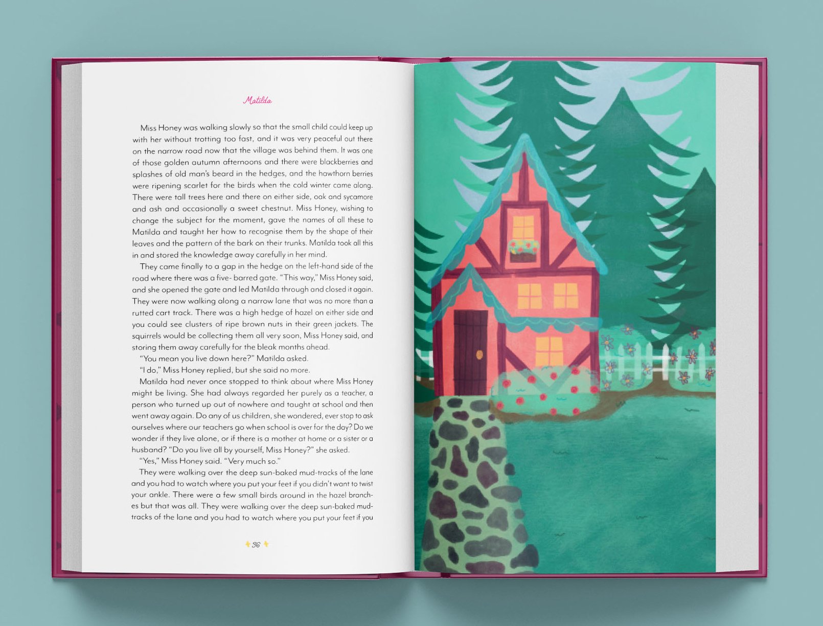
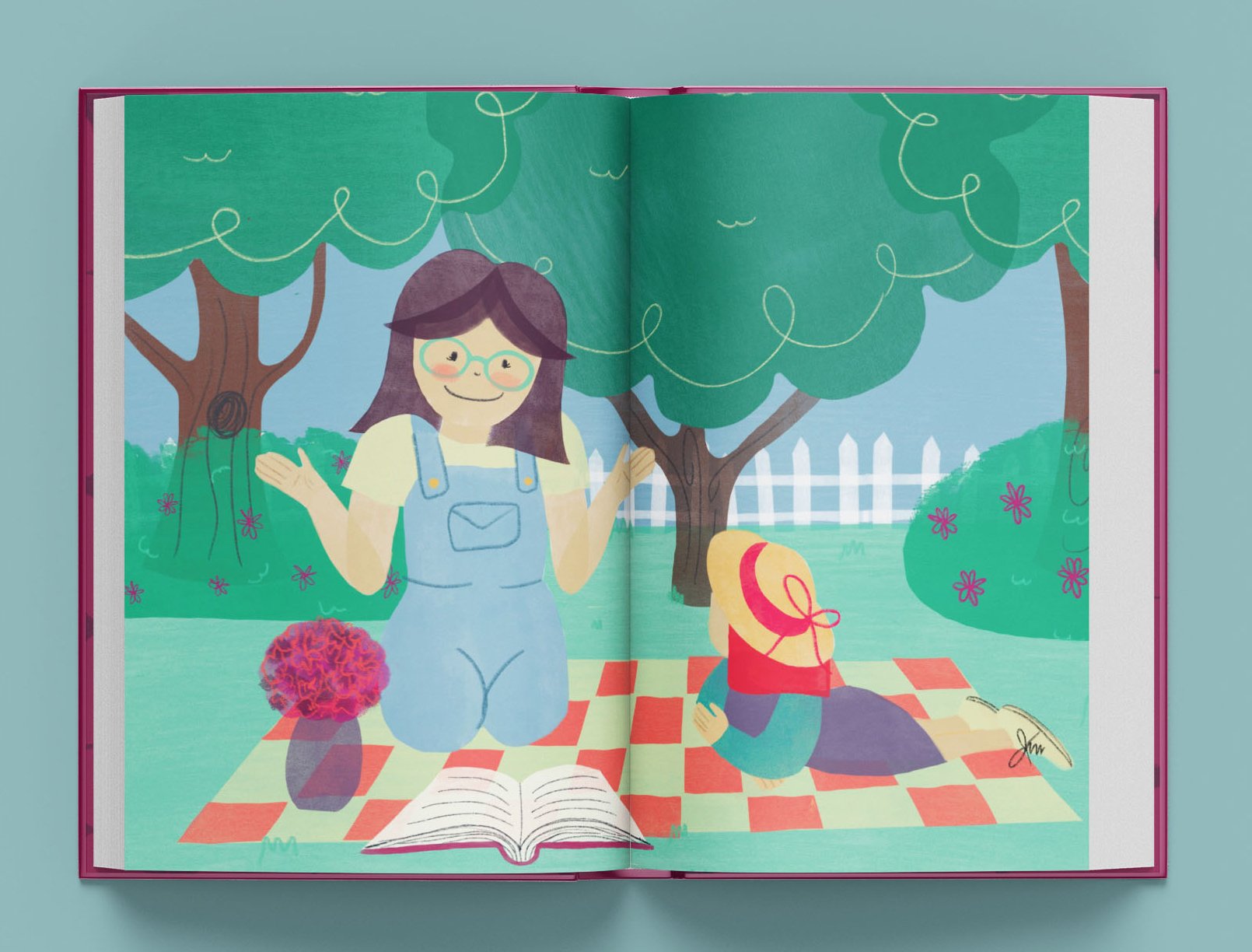
I was tasked with re-illustrating a book of my choosing for this project. I chose Matilda, as I was an avid Roald Dahl reader as a child, and thought I could create a really cute illustration style to go along with the book. The original illustrations for Matilda, done by Quentin Blake, are very messy and scratchy, which I’m sure he has his own reasoning behind. I, however, wanted to make the illustration appeal to children, with big round shapes, bright colors, and stylized characters.
Developing an Illustration Style
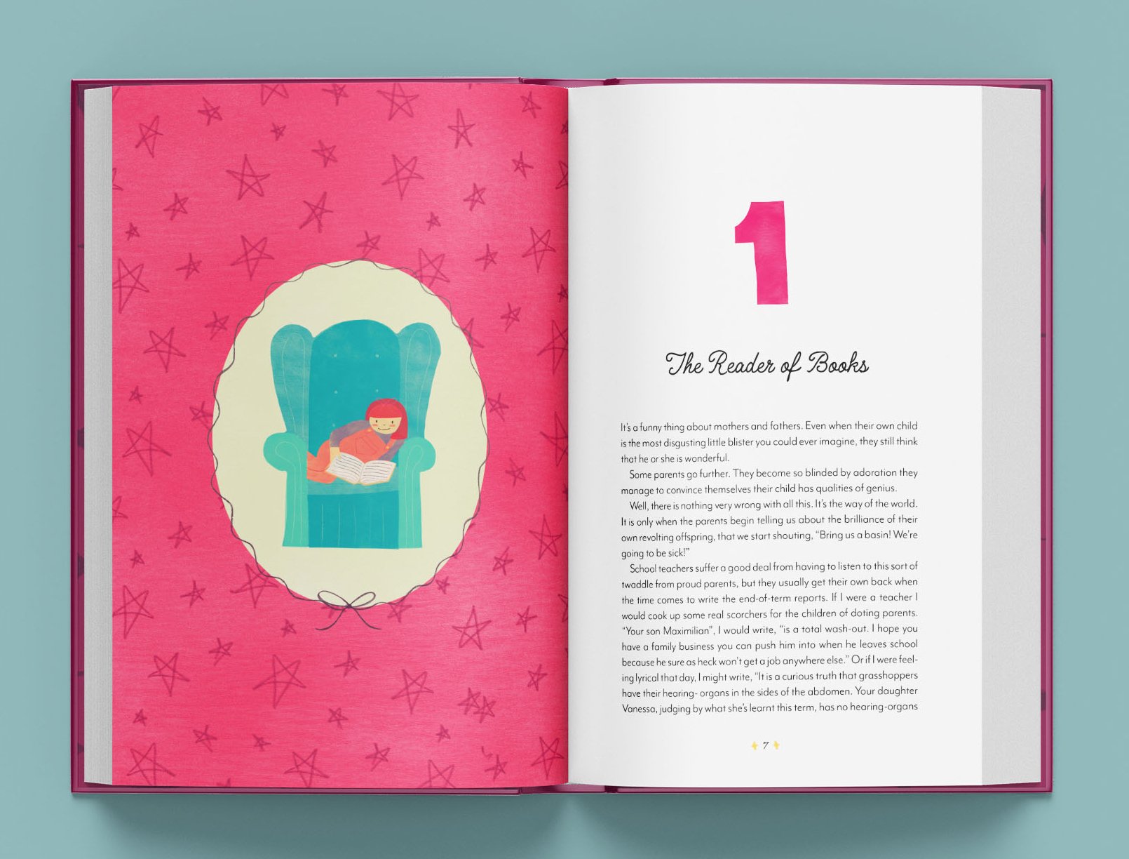
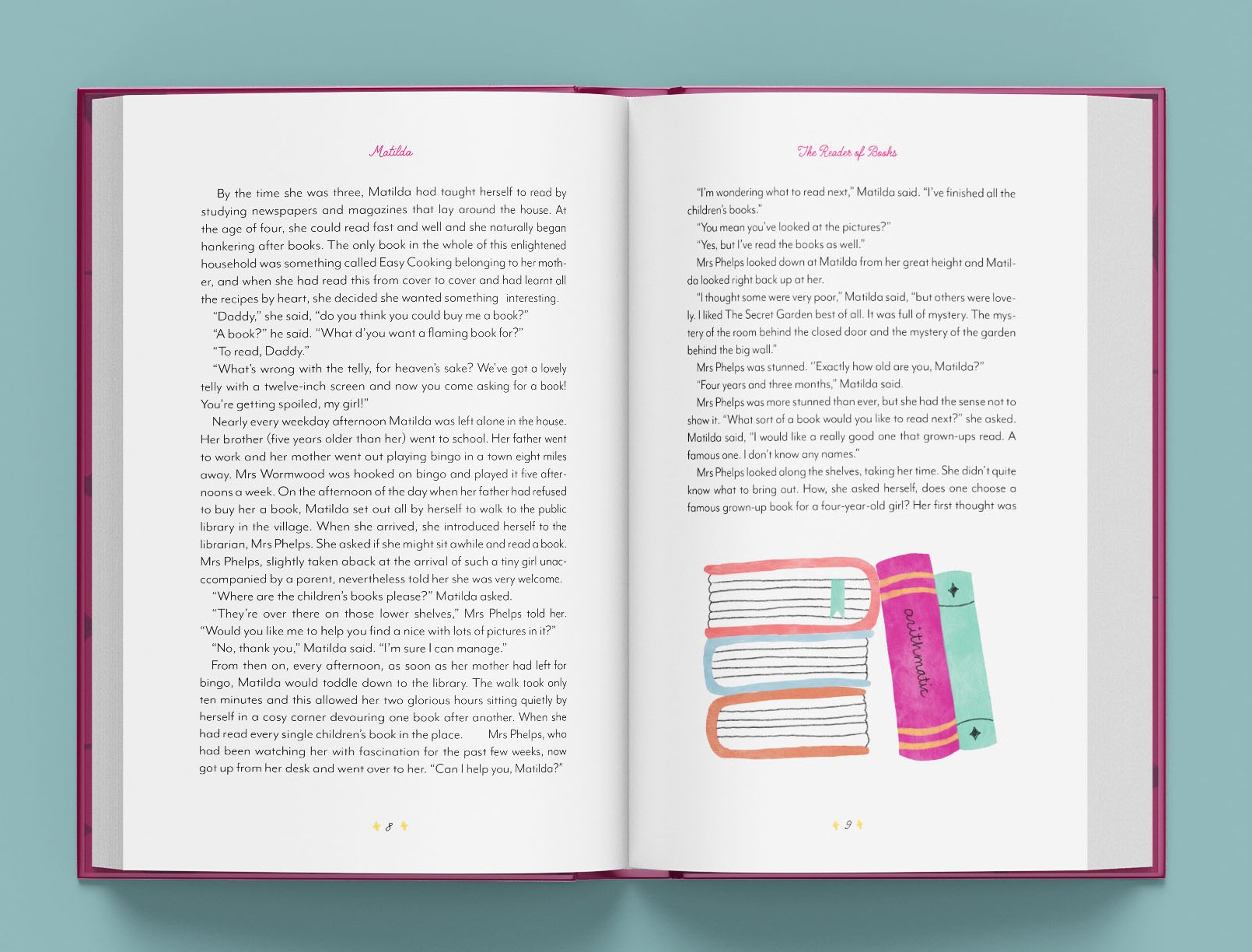
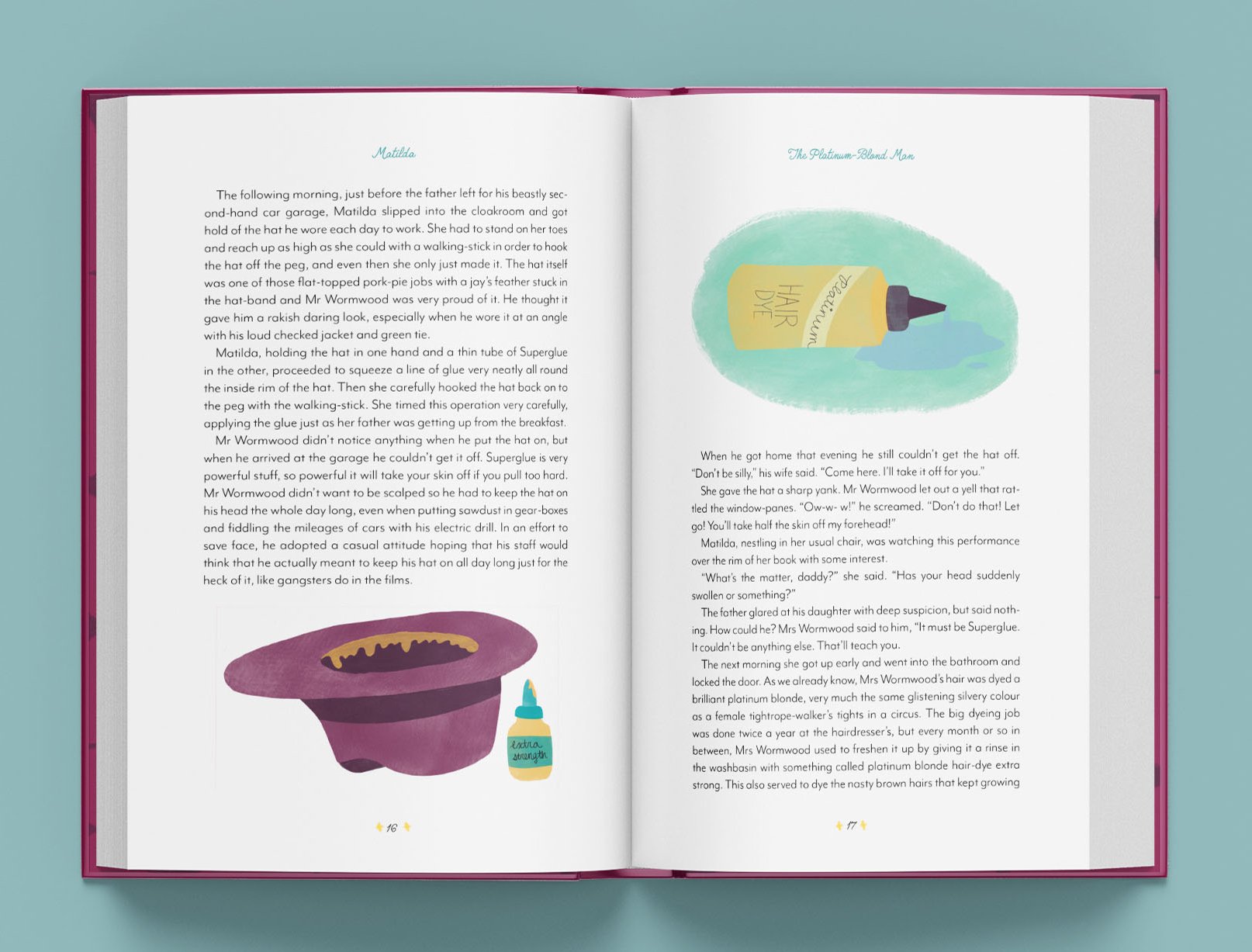
Starting off, I decided on a watercolor brush to create solid chunks of color, which I would then erase to get sharp, clean edges. I really enjoyed playing with the transparency of the brush, and thought this added some interest to the illustrations. I used a pencil brush when needed to add texture or outlines, but tried to keep it minimal. This achieved a cut paper look from the harsh edges of color which created a very playful, childlike mood.

Choosing Colors
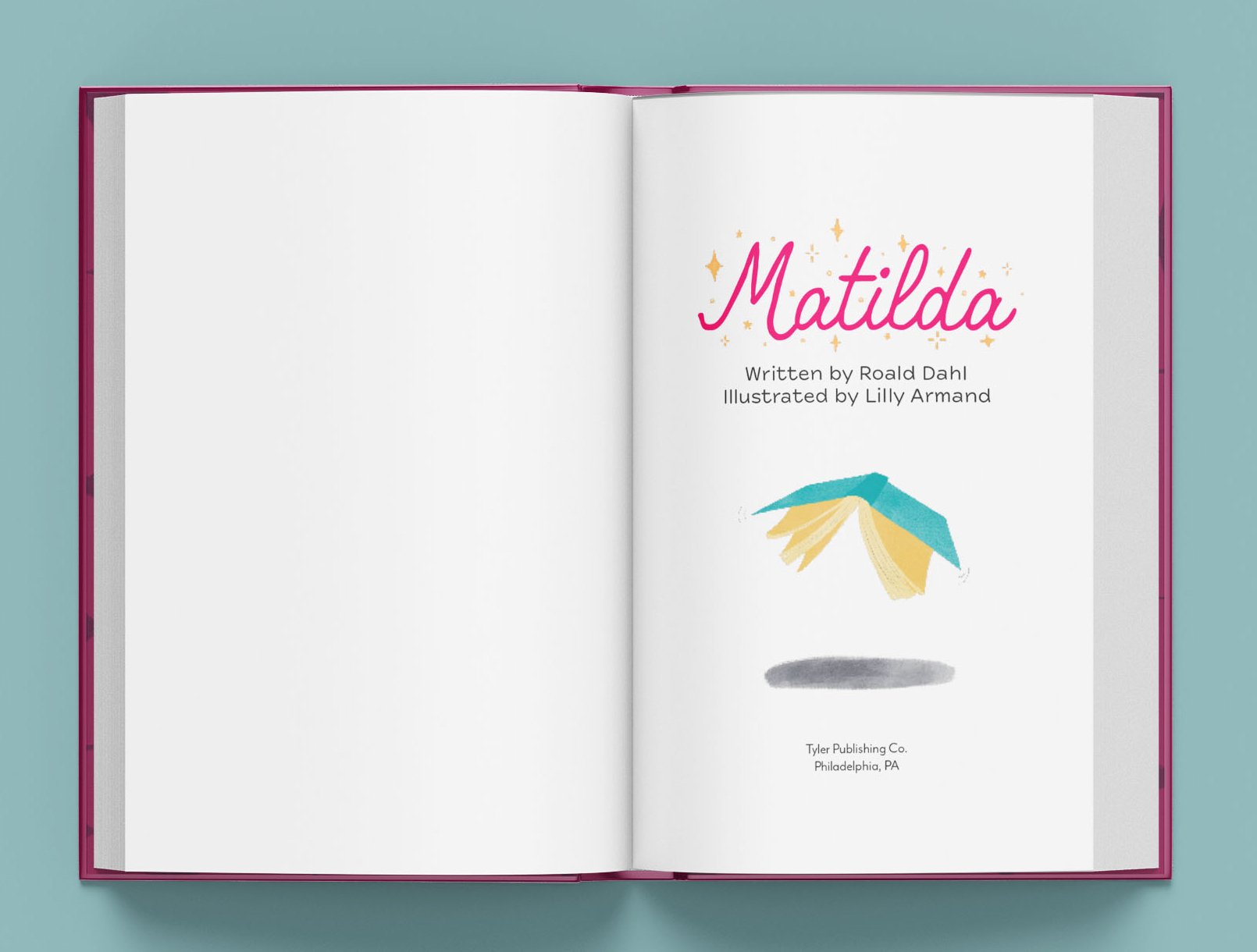
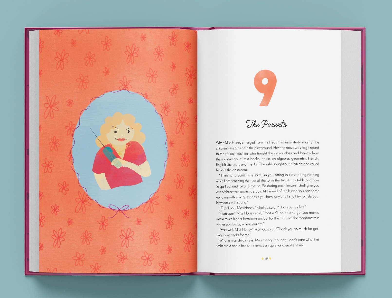
I knew I wanted this to be a colorful project from the start. I decided on a palette of vintage, jewel tones, including golden yellows, deep teals and purples, bright pinks, and burnt oranges. I tried to create as much color contrast in each illustration as possible, especially on the chapter openers which involved a full-color page with a portrait. The limited color palette solidified the art style and made sure that the book felt cohesive and complete.
Putting it All Together
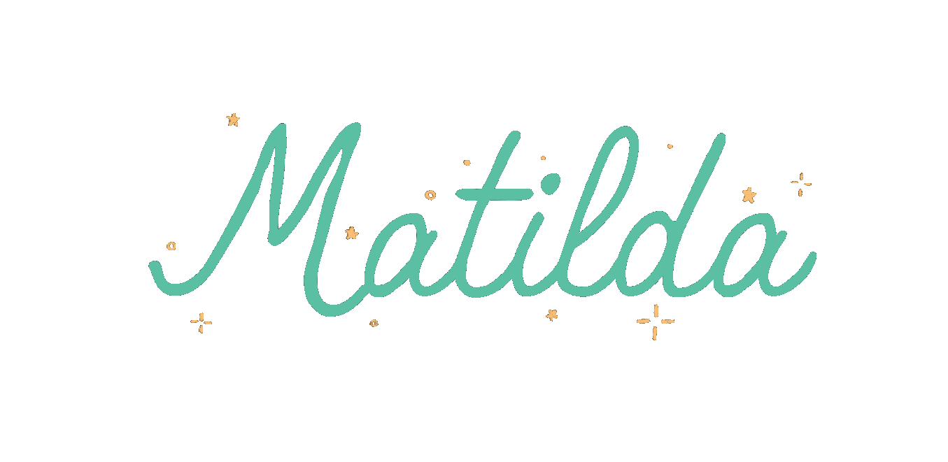
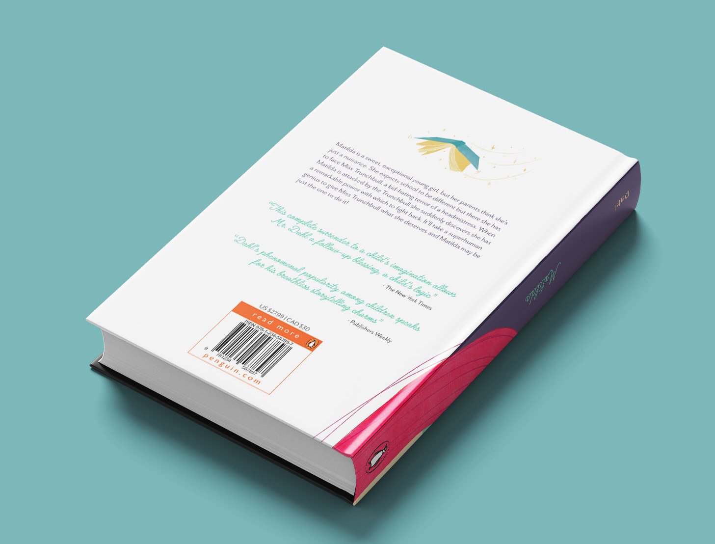
As I was working on the illustrations, I obviously had to pay attention to the words of the book as well. I used a sans serif type for the body of the novel, and a cartoony cursive font for the chapter titles, running heads, and page numbers. The simple type treatment really allows the illustrations to pop right off the page.


Institution: Tyler School of Art and Architecture
Course: Publishing
Instructor: Paul Kepple
Fall 2021