
For my senior thesis project, I created Peaks. Peaks is a beauty brand that specifically focuses on and formulates for acne prone skin. As someone who has dealth with acne and problematic skin, I felt like most brands have a line of products that were made for acne prone skin, but these lines lacked the attention to detail that comes with an entire brand dedicated to the issue.
Making Peaks, I wanted to create an acne positive makeup and skincare brand that empowers. Acne has been labled as ‘unsightly’ and ‘ugly’, and a lot of makeup brands are trying to pretend that acne does not exist. Overly retouched photos are encouraging the use of pore clogging, high coverage products that will make skin more irritated.
The goal of Peaks is to normalize acne and skin texture and allowing the consumer to make the choice of whether or not to cover their own mountains.
Creating a Brand
The Name
After coming up with the initial idea, I started to map out words that connected to the brand concepts. This word map led to the idea of mountains, as this is a common phrase I use to talk about my zits: “Oh my god, I have a mountain growing on my forehead”. Continuing with some more mindmapping, I eventually landed on the name Peaks. I felt that this word had a double meaning that could relate to my goal. Peak being the top of a mountain, and being the most confident you can be.
The Look
Now that I had my name, I instantly thought of a retro ski aesthetic. The stunning natural landscapes mixed with the funky bright colors of 70’s snow gear was a perfect visualization for the Peaks brand. I started researching 70’s style type, old skiing posters, and landscapes to start building the brand.
I decided to modernize the look of the brand slightly, to use gradients within the packaging. I wanted to make sure that the brand was retro inspired, but did not look outdated.
The Logo
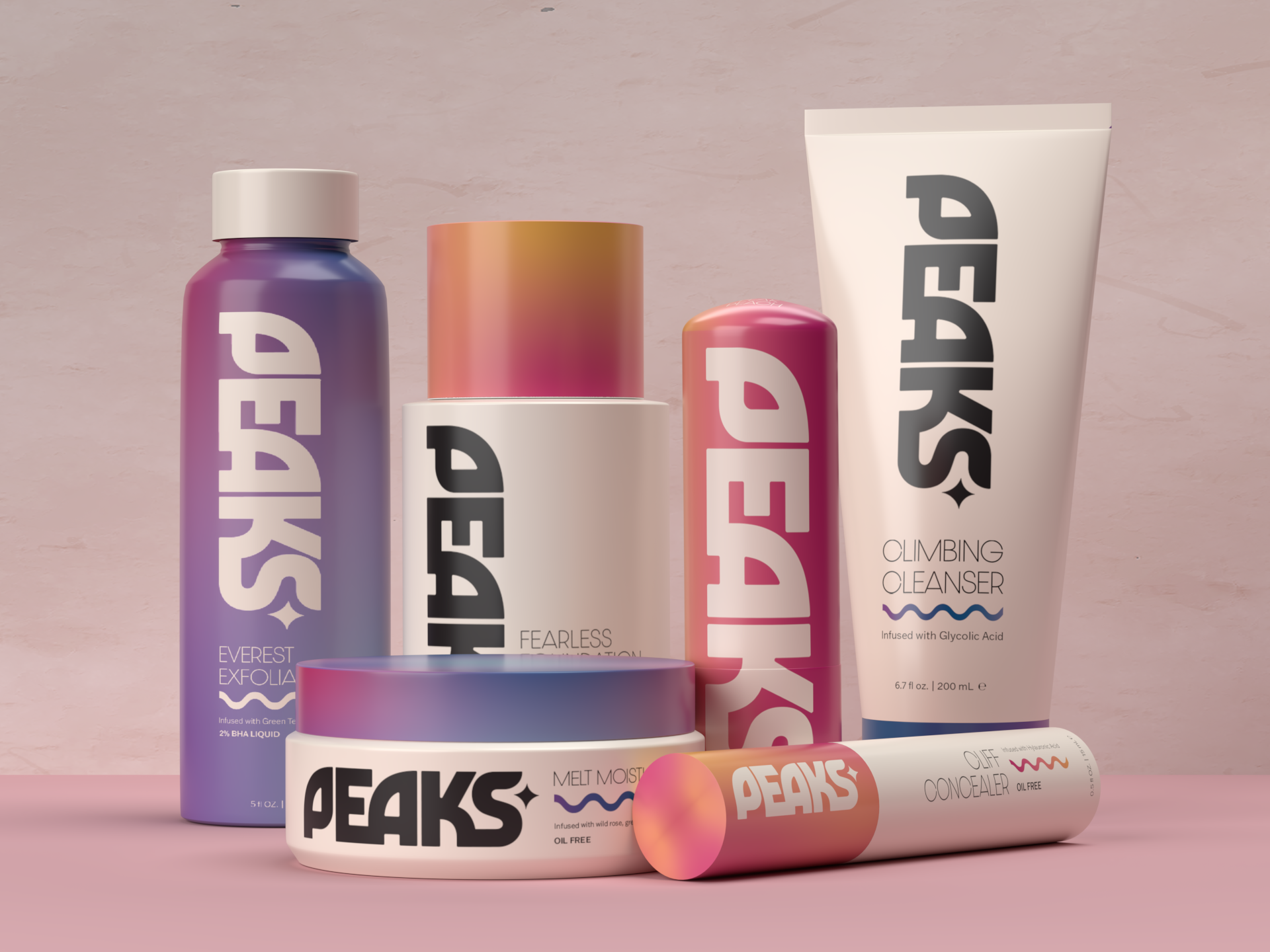
Starting with the funky typeface Marvin Visions, I typed out the name. I wanted to make sure the wordmark logo was not just text typed into Illustrator. I created a custom letter ‘P’ out of the ‘A’ to make the letters work together. I feel like the rounded ‘P’ made the wordmark overall a better shape, as well. Next, I connected the ‘E’ and the ‘A’, and the ‘K’ and the ‘S’, again to make the wordmark a little more cohesive. Lastly, I rounded out the top of the ‘S’ and used the curves to create the star element that I used as a graphic element in the rest of the branding.
Applying the Brand
The Packaging
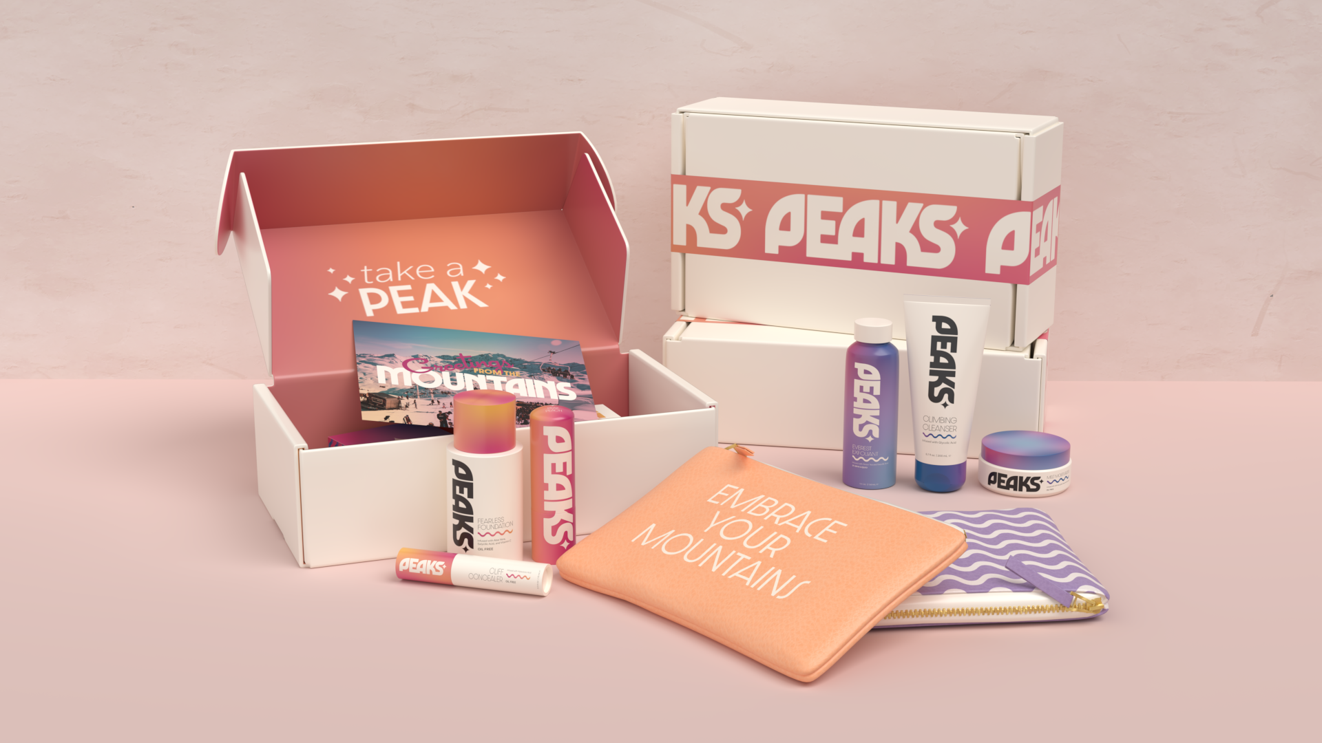
With the retro inspiration behind Peaks, I wanted to make sure to modernize the packaging so it did not feel outdated. I decided to use a base of an off-white color for most of the products with a cap or lid in the gradients. The boxes, then, will be full gradients to tie in the splash of the color on the products.
Color-wise, the makeup, will be pinks, oranges, and yellows, and for the skincare, it will be purples, pinks, and blues. One of each of the products will be a full gradient, thus the box accompanying being off-white instead.
Along with the packaging of the actual products, I wanted to make sure that receiving these products in the mail was just as much of an experience. For this, I designed a box, postcard, and matching tape.
Lastly, I created two styles of cosmetic bag to match the brand and store your PEAKS products in style.
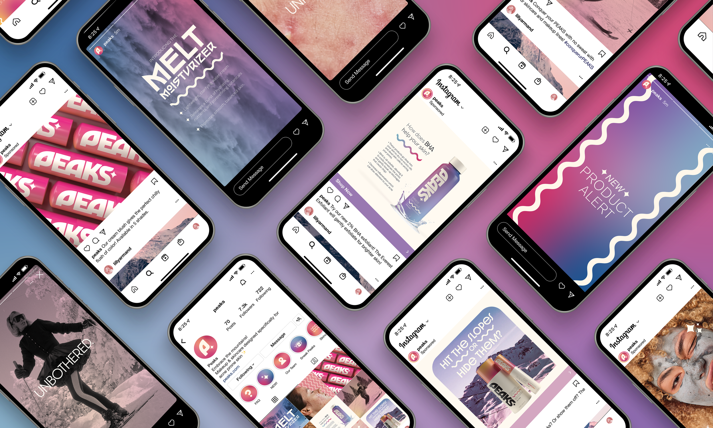
The Social Media
For the social media of PEAKS, I wanted to make sure we stood out from other beauty brands. With unapologetically unretouched photos, PEAKS’ goal is to normalize acne and show REAL skin. As a social media-addicted Gen Z person, I am very conscious of a brand’s social media presence. I wanted to create a feed that not only was informational but strengthened our brand identity in a cool and casual way.
Institution: Tyler School of Art and Architecture
Course: Projects in Authorship
Art Direction: Abby Guido
Spring 2022