

The Challenge
I was tasked with creating a new display typeface for this project in about 6 weeks. I had never made a typeface before and there was so much to learn about the intricate technicalities behind all your favorite typefaces. I decided to create a curvy, trendy typeface called Nimble.

Making a Typeface
Creating a typeface is a little overwhelming when first starting. After learning in-depth what goes into upper and lowercase letters, I started out by sketching an idea for letterforms in Procreate. Starting with the N, M, H, and U. These letters contain a lot of building blocks that I then used to create all the rest of the letters. Then after sketching, I brought the letters into Adobe Illustrator and traced each of them with the pen tool. Finally bringing these letters onto Glyphs and manipulating them into the final typeface.

My Final Thoughts
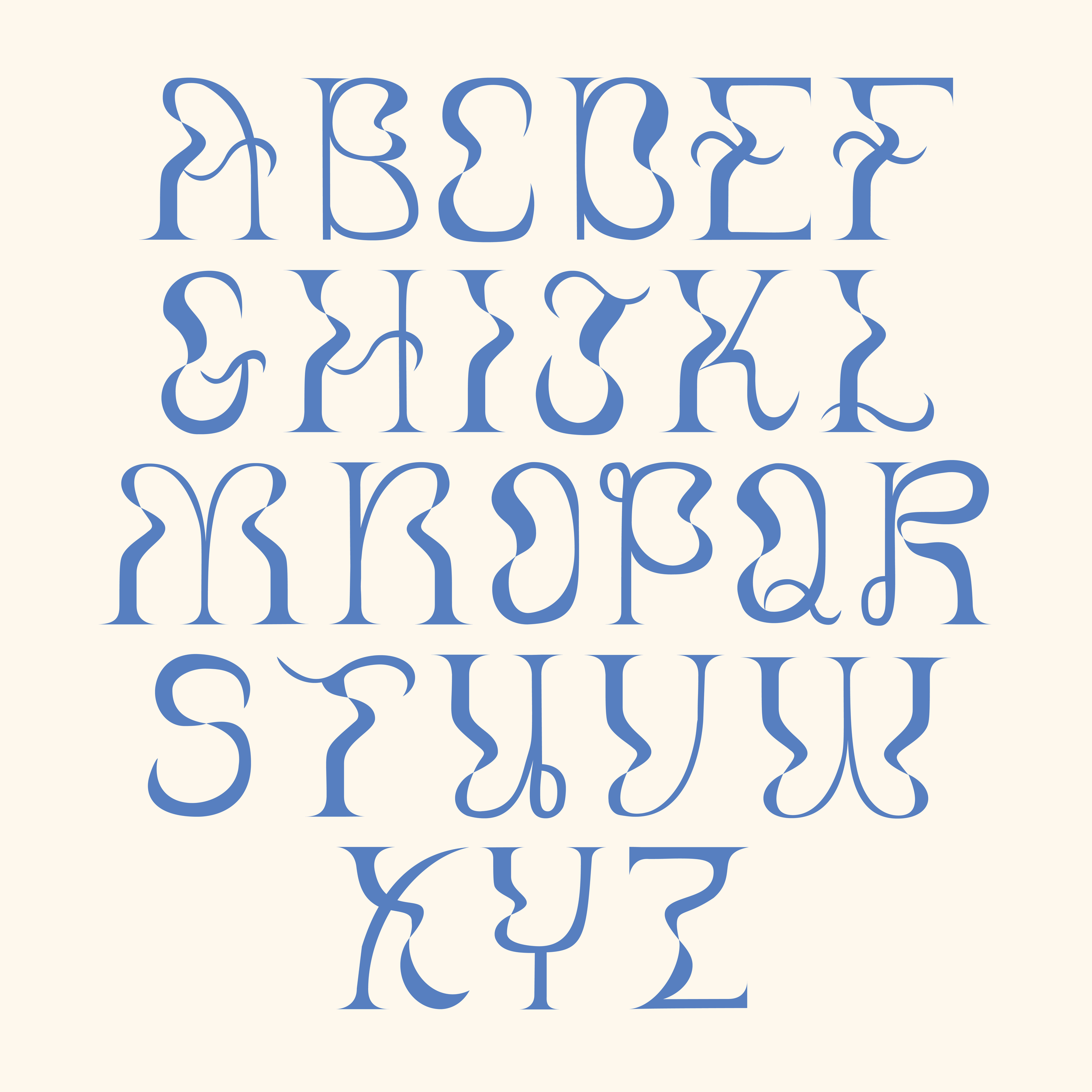
The intricate curves, while took hours to manipulate in glyphs, turned out with a perfectly imperfect charm. I decided to have each letter have a ribbon-like ‘twist’ in the middle. I wanted to set this typeface apart from all the other thin, curvy typefaces on Pinterest and did so with the twists. This project was a huge learning experience and I am thrilled with how this typeface came out within such a short timeframe.
Institution: Tyler School of Art and Architecture
Course: Type Design
Art Direction: Thomas Uhlein
Fall 2021