

The Challenge
I was tasked with making a magazine with a feature spread highlighting an AIGA Medalist for this project. After looking through the winners, I chose Maira Kalman. I was drawn to the quirky yet beautiful paintings that she creates. I needed to create a 3 spread feature article about Maira Kalman and her work for the assignment. I was also tasked to create a masthead and table of contents that could be used independently from the feature article as if this were a real magazine that would have a different subject next month. I decided to highlight the colors in images of Kalman's to create a simple, yet colorful masthead and table of contents that would change with each different artist.
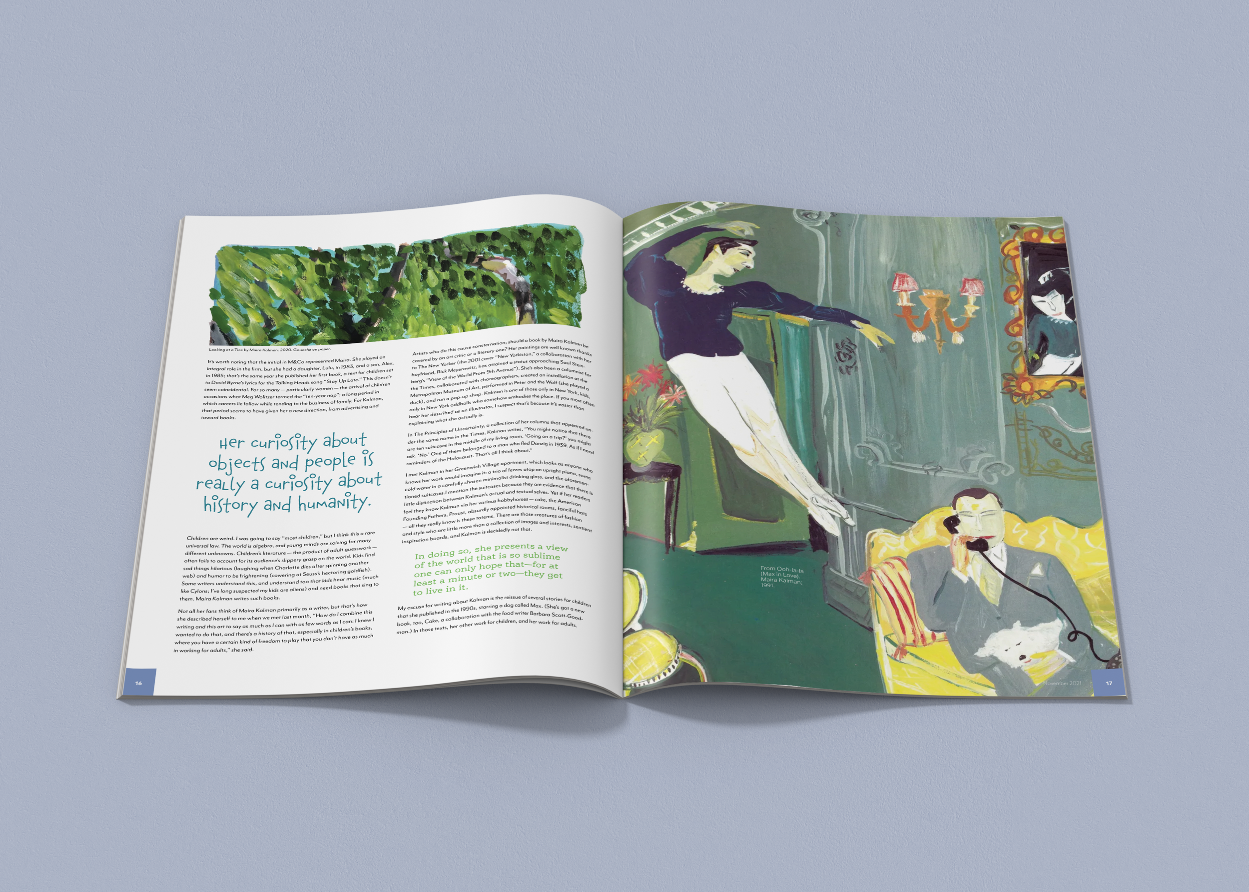
Connecting to the Artist
Maira created beautiful hand-done illustrations, and I was determined to highlight this throughout the spread. For each spread I took colors that are in the images for call-outs, titles, and backgrounds to make them unique from one another, but also cohesive. I played with her natural borders that are present in her works, and left some clean and sharp, while others look painted directly on the page.


Contrasting Typography
When approaching the typography for the body text of this article, I decided to use a very readable, simple, sans serif, Mr. Eaves. I did not want to overwhelm the reader or distract from the stunning, hand-painted imagery in the article. To connect to the imagery, I used a handwritten font as the title that looked a lot like the handwriting that is seen in some of her works. Finally, to find a balance between the two, I used a simple, yet quirky, slab serif type for the rest of the callouts.


Institution: Tyler School of Art and Architecture
Course: Typography
Art Direction: Jen Stern & Dermot Mac Cormack
Fall 2020