

The Challenge
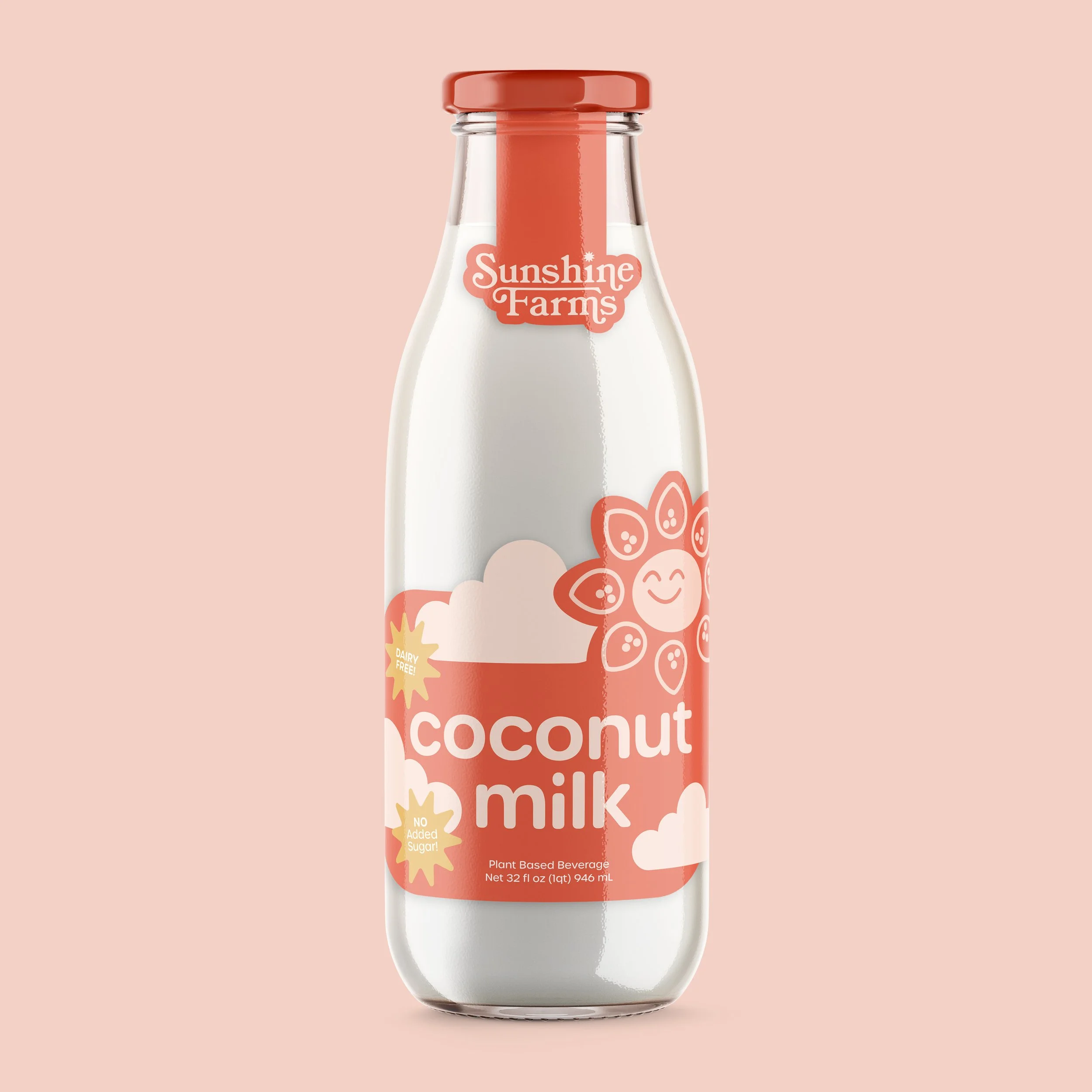
I was tasked with creating an alternative milk brand to target a specific audience for this project. I was assigned children ages 5 to 10. I decided on the concept of Sunshine Farms, a groovy and healthy milk brand that is sourced from sustainable farms.

Branding Decisions
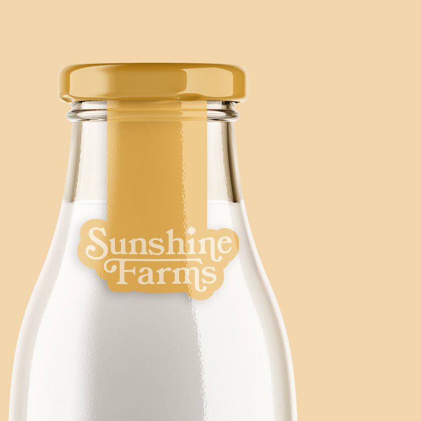
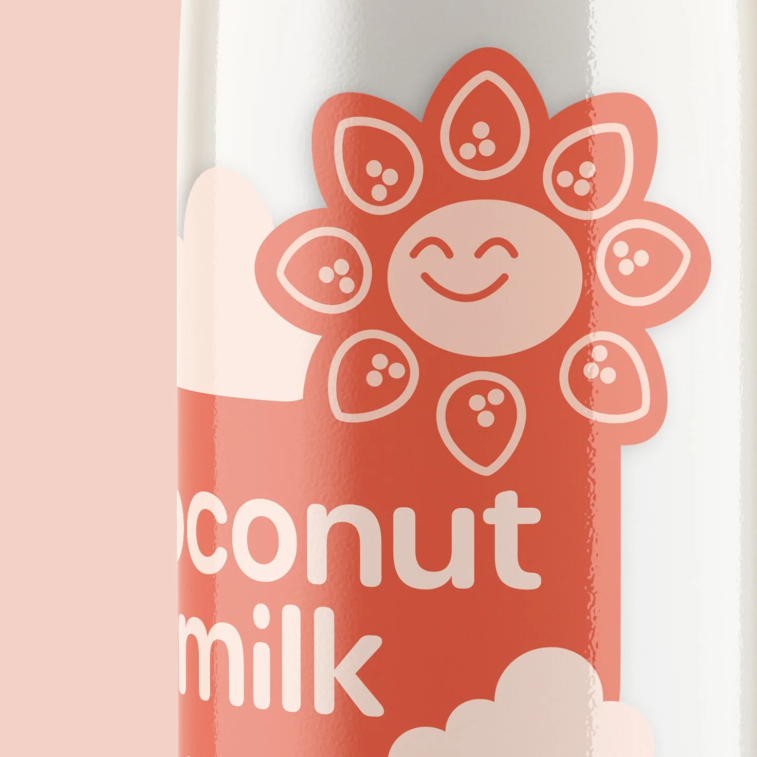
I wanted to create a brand inspired by a nostalgic 70’s style, but overly modernized, to include the new generations of children. I did this mostly with the retro-looking logo type, overusing the extended serifs to create a wordmark logo. As this brand is marketed toward the audience of young children, I decided to illustrate mascots to accompany the packaging. Each sunshine has customized rays to represent the ingredient present in the milk.
Choosing Colors
I wanted to make this colorful, as it is supposed to be fun for children, but not overwhelming. I decided to stick to a version of the primary colors as this screams ‘kids’ to me. Using the different colors to represent the different ingredients gets rid of the possibility of an accidental mixup (which could lead to a possible meltdown when mom or dad brings home the wrong kind of milk from the store). The monotone packaging of each bottle makes sure differentiation and remembering which type is easy. While this product is meant to be appealing to children, making the lives of caretakers or shoppers easier was always in the back of my mind.


Institution: Tyler School of Art and Architecture
Course: Brand Identity
Art Direction: Caleb Heisey & Dermot Mac Cormack
Fall 2021